Live glucose graph
Check it out here!
This project was inspired by the SugarPixel, a customizable LED matrix clock for folks with diabetes like myself. I think that product is pretty cool, I want to make one myself sometime.
So in order to make one of these, the first step is to get the glucose from
my CGM
somehow.
By the time I got this working, I thought it would be a cool idea to make a web app
out of it for now and put it on my site.
Features
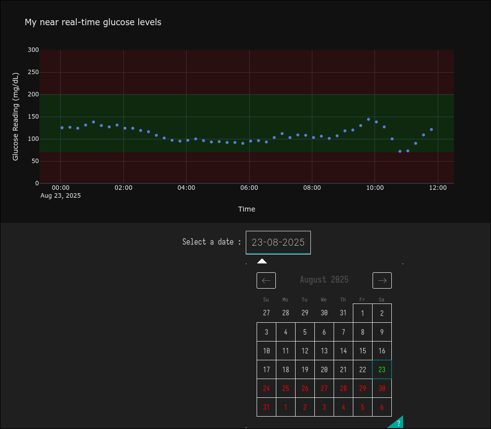
The glucose graph has the following features:
- Live updating with about 30 minutes delay.
- Date selection.
- Interactivity.
- Live updates every 30s.
How do I get the data
So I knew that most CGMs including mine transmit data over BLE to the receiving host (phone or dedicated receiver). And I also knew that abbott has a web app intended for doctors to monitor their patients remotely called LibreView. Finally there is also a service for sharing glucose data with others called librelinkup.
What this means in regards to the latter two, is that my information is being
saved in the cloud somewhere.
And if I can access it manually, then so can a program.
So it turns out that this problem is already solved by some cool people on
github: DiaKEM.
They reverse engineered the librelinkup app and provided a typescript
client and API for
anyone to use.
I don't know typescript though so I just found someone that made a
python client for this API.
Big thanks to Rob Berwick for this!
Getting this client was incredibly easy, after creating a virtual environment,
I simply just followed the instructions on Rob's github page and had values printing
in less than 10 lines.
Later on I made this program update a simple sqlite db with the date and values if new values where retried since the last update.
Creating a graph
Now I had solved the first part with retrieving data from my CGM.
It's worth noting that I decided to make the program that updates
the db with new values separate from the web app.
That way in case I had problems with the app, I would not loose any new values.
To make my web app I choose to use the plotly
python graphing library.
I had already used it before (I used it to vibecode a heat map style
plot of a building for one of my classes).
But this time around I invested more time into it to understand how things worked
properly.
It wasn't too difficult though, the plotly
documentation
has plenty of examples to get started, including some for
scatter plots that I wanted to
use.
The hardest part for me was understanding the different components there are to making a web app.
Initially I did not understand the difference between plotly and dash and what the purpose was.
I just navigated the documentation looking for examples and praying for one to work.
Only when I sat down and took my time to read in more detail
I understood the purpose of each of these
modules.
Building a Web App
Plotly just allows you to build a graph and Dash
is the module that turns it into a proper web app.
Dash is in fact built on flask,
a python WSGI web app framework.
So it is entirely possible to use plotly with flask but dash is recommended as it
supposedly integrates better with plotly.
Dash has a module called
core components
that allows you to integrate some interactive elements into you app easily.
Since it is not a good idea to load and entire database into a graph and since I
only wanted to show my glucose changing over a certain interval of time I decided to
implement a graph that displays my levels over a day.
And to control what day is displayed, I simply used the
DatePickerSingle
component.
I then just attached a callback to it and made a call to a sqlite db where I store my glucose data.
So once the web app is developed, you want to deploy it. And, as highlighted by
the flask documentation
using the development server should not be used in production.
Instead, one should either use a dedicated WSGI server or hosting platform.
Since I am using a VPS to host this site I decided to use a WSGI server.
The purpose of using a WSGI server is to translate HTML to WSGI and the other way around.
I decided to use gunicorn as my WSGI server.
To be clear when I was learning about this, nothing was obvious. That's why in order to make it easier I first deployed a very simple demo web app. I often find that if I can't solve a complicated problem, I simply just haven't broken it down enough.
Automatic restarts
In order to make my applications robust I implemented automatic restarts by using systemd services. That way if my server restarts for whatever reason it will just start automatically without me having to worry about it.
Debugging
After writing and deploying my app and checking in on it a day later I realised
the date selection for the current day was not updating.
This was simply due to the fact that I was not updating the selected and maximum
allowed date on the graph.
To solve this I used another dash core component: intervals.
Intervals is simply a component that fires a callback periodically every x milliseconds.
Inside of this callback we can simply return the new values for our
date and max_date_allowed properties.
Additionally, I wanted the graph to update periodically when new values where available, so I added another callback to regenerate a new graph every 30 seconds.